Proper Material Theming in a Multi-Module Setup
Basic Setup
Recently an opportunity opened up for us to fully utilize a Material Theming & Styling setup in one of our new projects. We took some time to dig into this topic and made a clean setup in order to prepare for a long-term running project. This article will describe the results and our learnings.
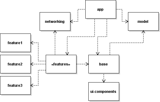
Let’s start with the basic setup: as with all of our projects we use our A3AndroidTemplate as a starting point. From there we extend the gradle module setup to prepare for the future: next to the main module app, we’ll use some shared modules like base (contains e.g. BaseActivity or BaseFragment), networking (holds Retrofit dependencies) or model (contains shared data classes) and feature modules. The advantage of this kind of multi-module setup was already explained exhaustively by other authors at other blogs (see here or here, so here we’ll not go into this again.
Some notes to the setup which will get relevant later:
appholds the AndroidManifest.xml, uses thecom.android.applicationgradle plugin, generates the apk and only includes other modules, but is not included anywhere itselfbaseholds dependencies to the required shared modules likemodelorui-componentsfeaturemodules always includebaseand possibly along with other shared modules as needed (e.g.networking)ui-componentsholds the theming & styling configuration
Understanding What Needs To Be Done Where
Let’s begin with the first question that usually arises: Where shall the theming be placed?
It sounds like a simple question, but it’s not a simple answer, because:
- The Theme has to be referenced from AndroidManifest in the
appmodule - The
appmodule itself is not included in other modules, therefore the preview of the layout editor in AndroidStudio has no access to the Theme — which basically means, that we would have to work blind.
The solution is to map the module dependency into the theme itself — meaning that there is an AppTheme.Base in the ui-components module, which defines the whole theming, and an AppTheme in the app module, which inherits from AppTheme.Base. Issue solved!
Theme VS Style
Before we can actually start the implementation, one last thing is missing: understanding the difference between “style” and “theme”. It might be a common concept, but it doesn’t hurt to recall it once again.
Chris Banes describes it as follows:
So what exactly is the difference? Well they are both declared in exactly the same way (which you already know), the difference comes in how they’re used.
Themes are meant to be the global source of styling for your app. The new functionality doesn’t change that, it just allows you to tweak it per view.
Styles are meant to be applied at a view level. Internally, when you set style on a View, the LayoutInflater will read the style and apply it to the AttributeSet before any explicit attributes (this allows you to override style values on a view).
Values in an attribute set can reference values from the View’s theme.
TL;DR: Themes are global, styles are local.
You can read more about it in his article Theme vs Style
Android Material Components Library
So now that everything is set, we can finally start the theming & styling. We use the new Android Material Components library for this, as it is now the recommended way of Google. The library offers a great variety of customization — far more than the we used to have. It took some time to look through all the possibilities and new named attributes. E.g. there are now color attributes like colorOnPrimary, colorOnSecondary, colorTextPrimary or colorTextSecondary. These attributes are theme colors and are therefore meant to be set once and used globally — no more @color/colorYellow, they are applied by the global theme! Same applies for the TextAppearance attributes.
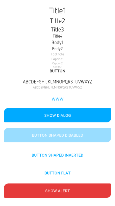
In general, the library offers 3 theming areas:
Summary: The final setup
The final result looks as follows:
- The
AppTheme.BaseStyle is located in theui-componentsmodule, we extend it withAppThemeinapp - All styles are grouped in the
ui-componentsmodule
Since having an extensive customized styling, the default styles.xml would simply explode, we started to group the different styles into separate files. At the moment of writing, this includes:
buttons.xml— defines common button styles (see appendix 1)dialogs.xml— defines common dialog stylestext.xml— defines inheritances from TextAppearancethemes.xml— defines the global theme
Appendix 1: Button Styling Example
<?xml version="1.0" encoding="utf-8"?>
<resources>

    <style name="Widget.App.Button.Shaped" parent="@style/Widget.MaterialComponents.Button">
        <item name="android:elevation">8dp</item>
        <item name="backgroundTint">@color/button_round</item>
        <item name="android:textColor">?colorOnPrimary</item>
        <item name="shapeAppearance">@style/Appearance.App.Button.Shaped</item>
        <item name="enforceTextAppearance">@style/TextAppearance.App.Body1</item>
        <item name="android:padding">16dp</item>
    </style>

    <style name="Widget.App.Button.Shaped.Inverted" parent="Widget.App.Button.Shaped">
        <item name="backgroundTint">@color/button_shaped_inverted</item>
        <item name="android:textColor">?colorPrimary</item>
        <item name="rippleColor">@color/button_shaped_inverted_ripple</item>
        <item name="enforceTextAppearance">@style/TextAppearance.App.Body1</item>
    </style>

    <style name="Widget.App.Button.Shaped.Alarm" parent="Widget.App.Button.Shaped">
        <item name="backgroundTint">@color/button_shaped_alarm</item>
        <item name="android:textColor">?colorOnPrimary</item>
        <item name="enforceTextAppearance">@style/TextAppearance.App.Body1</item>
    </style>

    <style name="Appearance.App.Button.Shaped" parent="">
        <item name="cornerSizeTopLeft">@dimen/cornerShapedBig</item>
        <item name="cornerSizeTopRight">@dimen/cornerShapedSmall</item>
        <item name="cornerSizeBottomRight">@dimen/cornerShapedBig</item>
        <item name="cornerSizeBottomLeft">@dimen/cornerShapedSmall</item>
        <item name="enforceTextAppearance">@style/TextAppearance.App.Body1</item>
    </style>

    <style name="Widget.App.Button.Flat" parent="Widget.MaterialComponents.Button.TextButton">
        <item name="enforceTextAppearance">@style/TextAppearance.App.Body1</item>
    </style>

    <style name="Widget.App.Button" parent="TextAppearance.MaterialComponents.Button">
        <item name="fontFamily">?fontFamilyPrimary</item>
        <item name="android:textColor">?android:textColorPrimary</item>
        <item name="android:textStyle">bold</item>
        <item name="enforceTextAppearance">@style/TextAppearance.App.Body1</item>
    </style>
</resources>
<?xml version="1.0" encoding="utf-8"?>
<selector xmlns:android="http://schemas.android.com/apk/res/android">
<item android:color="?colorPrimaryVariant" android:state_enabled="false" />
<item android:color="?colorPrimary" />
</selector><?xml version="1.0" encoding="utf-8"?>
<selector xmlns:android="http://schemas.android.com/apk/res/android">
<item android:color="?colorPrimaryVariant" android:state_enabled="false" />
<item android:color="?colorSurface" />
</selector><?xml version="1.0" encoding="utf-8"?>
<selector xmlns:android="http://schemas.android.com/apk/res/android">
<item android:color="?colorPrimaryVariant" android:state_enabled="false" />
<item android:color="?colorSurface" />
</selector><?xml version="1.0" encoding="utf-8"?>
<selector xmlns:android="http://schemas.android.com/apk/res/android">
<item android:color="?colorAlarm" android:state_enabled="false" />
<item android:color="?colorAlarm" />
</selector>